Learn to spell hippopotamus
 Jamsta Grafix
What’s spelling got to do with design? Isn’t that the author, writer, contributor, editors gig? I have enough to worry about with layout, fonts, colour palettes and those damn tables, not to mention the back-and-forth with the client trying to explain the importance of a vector file verses a gif file.
While this is true, it would be a perfect world if all your copy was supplied in perfect format, with correct spelling and grammar 100% of the time, but, in reality, that’s not the case. To save yourself some of the hassle of back-and-forth editing corrections, or the embarrassment of going into production with a ‘typo’ or a completely misspelled word is kind of a drag when you may have spent so much time and effort getting the design and balance to look perfect. It undoes everything. It’s a huge help (to you and your client) to be on top of your spelling and grammar game. I have been fortunate, that over the years I’ve worked with many great editors in publishing, which in most cases have given me clever constant corrections that I have been able to observe and learn from so as I can pick-up some of these tips before the next round of corrections. When to use an en dash over and em dash, why a hyphen is not either of those and a bullet point should be a bullet point.
“Fuck! Western is spelt wrong”
Not all publishers, editors and authors can get it right all the time, so being on top of your game can be a lifesaver. I was witness to this back in the late 90s working for Lonely Planet Publications, a company with a vast amount of fantastic, clever and on-point editors and authors. My role was that of cover and advertising collateral designer, of which I was one of about 5 in our team. Our main role was designing the guide book covers, which had a shelf-life of around 3-4 years before being updated. It was an important role to get the cover right, as it’s shelf life was that that lasted longer than say a magazine ad. One of the biggest books we produced at the time was Western Europe, and many many editors, publishers, heads of departments etc. had a say in the final design, copy, colour – you name it, they had a say. The designer responsible for this particular edition was a seasoned professional, meticulous with their work, slow even, but thorough. Cover artwork is designed with the back cover, spine and front cover as one, so, the spine is vertical in-between the back and front covers obviously. Many eyes viewed and commented over days, weeks to make sure this cover was perfect, before going into print for it’s new edition. Many weeks had passed, when the person involved in procurement got the first samples from the print-run on her desk while the shipment was arriving at the docks. I happened to be there when her eyes bulged in horror. “Uhm, can you tell me what you see here?” she says as she hands me a copy of the book. I’m looking for print errors, colour shifts, bad registration, badly aligned artwork, when suddenly I turn to the spine. “Fuck! Western is spelt wrong”. There’s 40,000 copies printed and landed at the dock ready for distribution to book sellers. That’s embarrassing.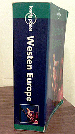
So, the point is, learn to spell or at least be aware to look for typos, they happen more than you think. Get someone else to read your artwork. Print it out and read it off screen – trust me, it helps. Copy the text out into a word-processor like MS Word and spell check if your design software doesn’t have it. It’s easy for us designers to get carried away with the shapes, colours, negative/positive spacing etc of the artwork, but, there’s more to it, and with that bit more care, not only can you save you or your client embarrassment, it can save a bunch of money too.
Here’s a few signs that prove it can happen to anyone.

![]()
 Jamsta Grafix
 Jamsta Grafix